
Selected project
This showcase presents Since21 Creative’s work for WeBest Education. The public project scope includes branding concept, visual identity, brand elements, merchandise.
WeBest Education is a Malaysian education group founded in 2008, a growth partner for children from age 3 to 17 through tuition and childcare.
Build a brand story and a visual identity that make years of quiet, steady work visible to parents.
Education brands often sound alike. WeBest needed one idea that was warm, believable and its own, and an identity that works in English and Chinese.
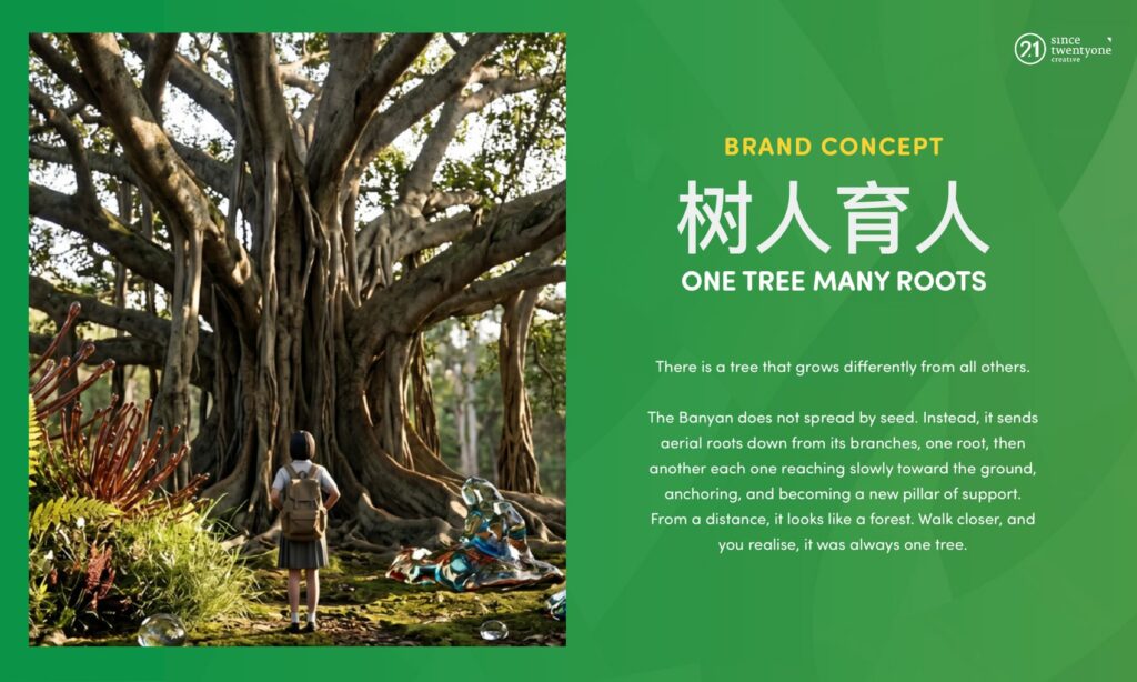
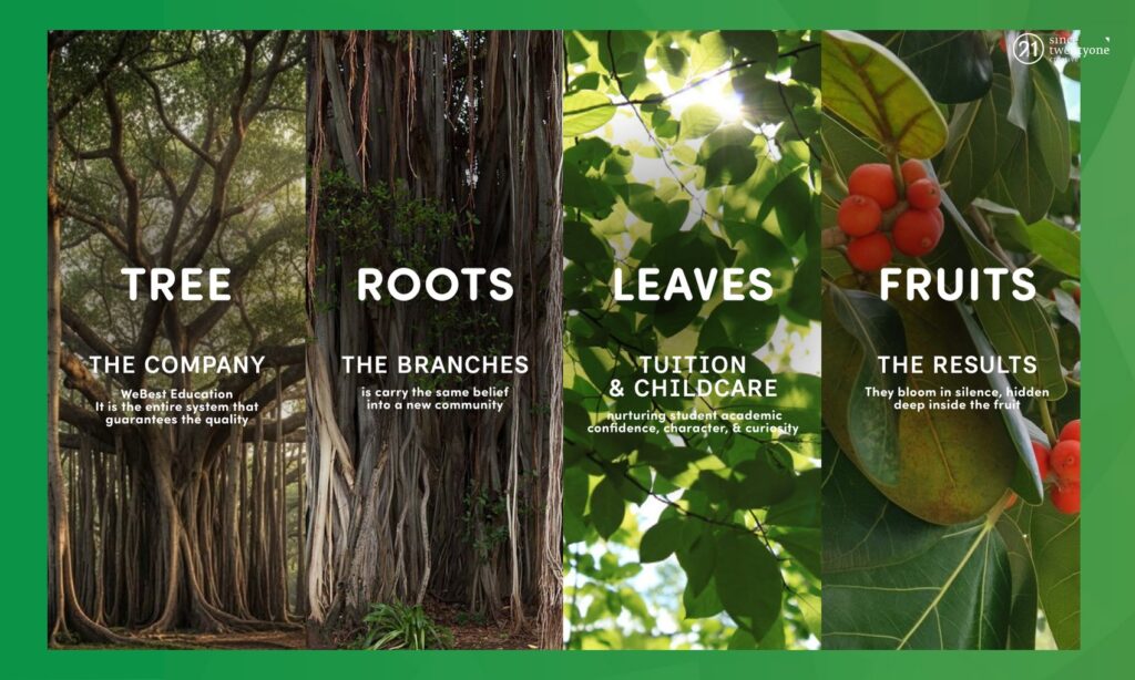
The banyan tree: one tree, many roots. The idea carries a brand narrative, a logo, a green and sunshine palette, a rounded typeface, four graphic elements and everyday merchandise.
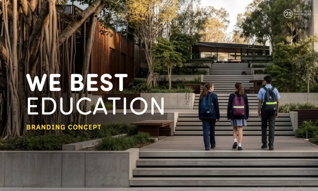
A banyan grows differently from other trees: roots come down from its branches and anchor it. The same idea shapes how WeBest sees its teachers, its families and its community, in the line 树人育人.
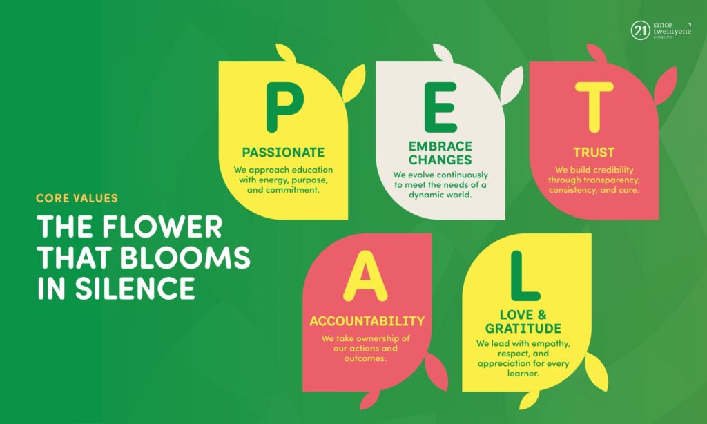
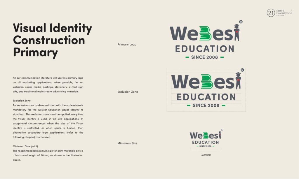
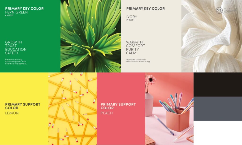
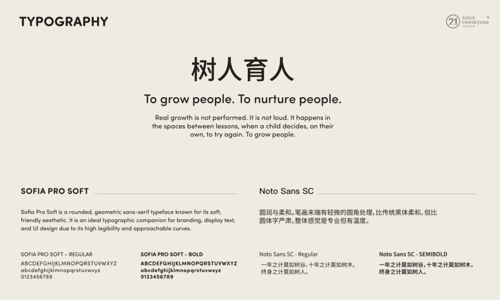
The logo sits in a clear space with fixed minimum sizes. Fern green and warm cream lead, with lemon and peach in support, set in Sofia Pro Soft and Noto Sans SC.
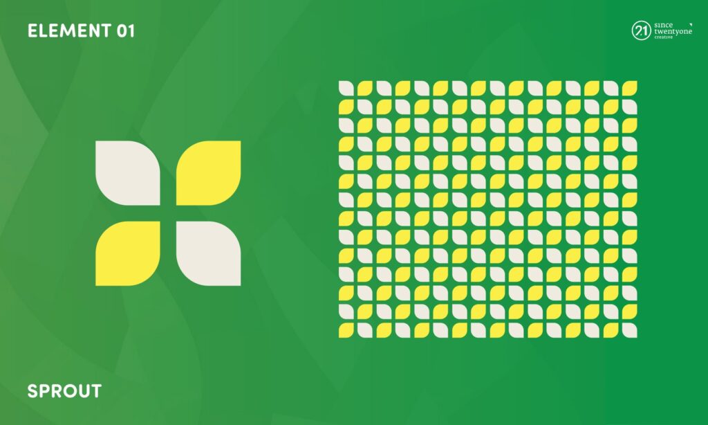
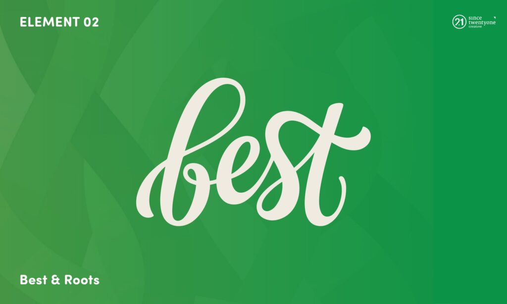
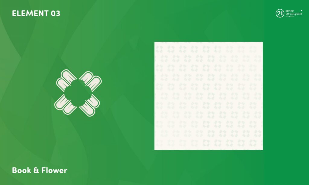
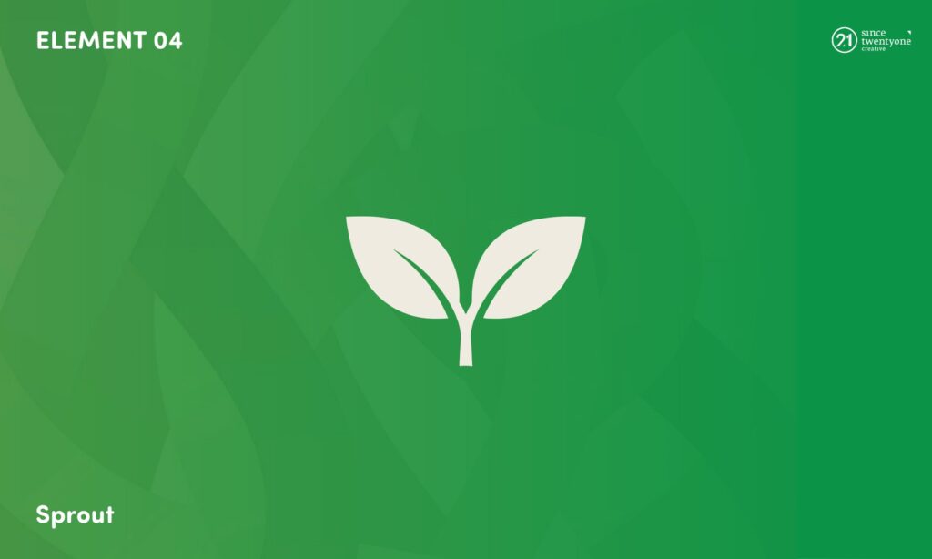
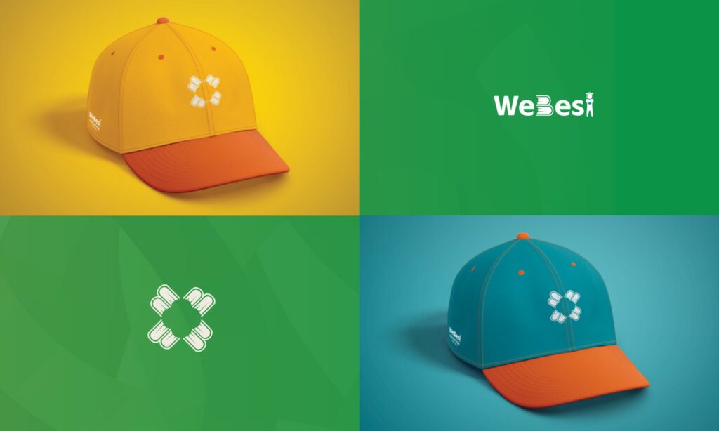
A sprout, a flowing script “best”, a book that blooms into a flower, and a leaf pair. Each works alone or as a repeating pattern.
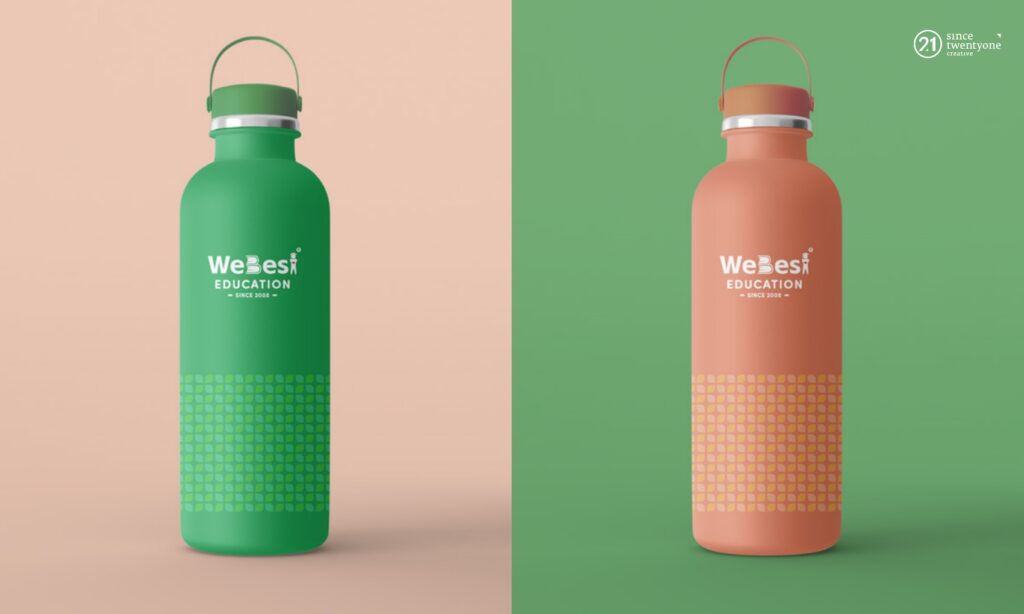
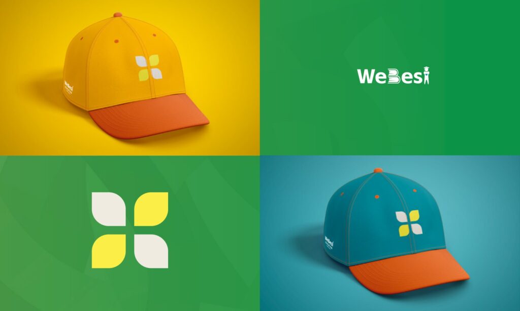
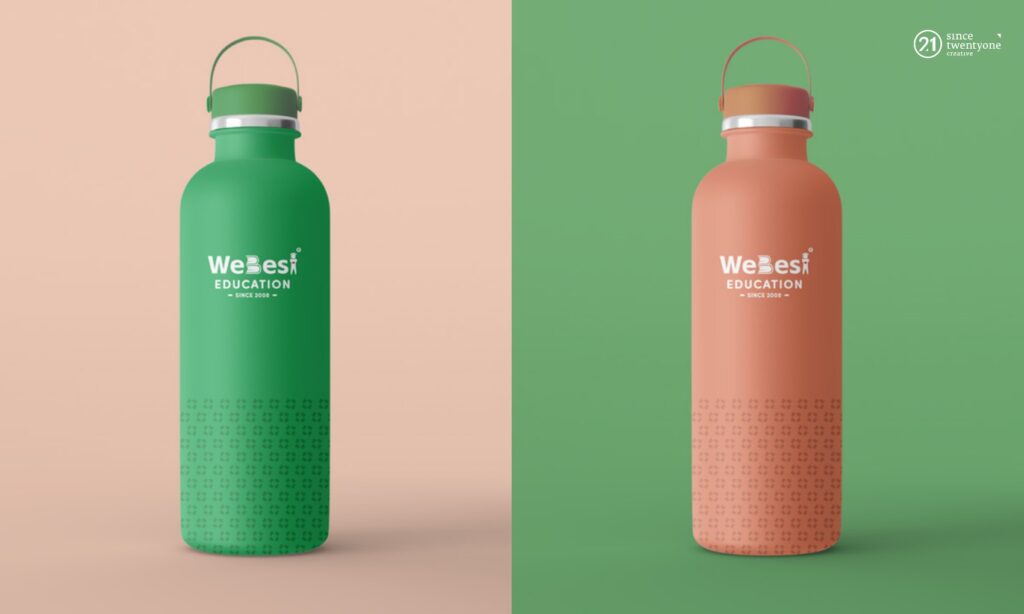
The identity moves onto everyday items: water bottles in green and coral with a leaf pattern, and caps in sunshine yellow and teal.
Looking at a similar brief?
Explore our branding and coaching service or see more of our artwork.
Contact Since21